There are many forms of advertising bands most commonly with magazine ads in magazines such as; NME, MOJO, Rolling Stones, Q, Kerrang and Billboard. Each focusing on one or more genre.
George and myself want to use a magazine advertisement.
 How do bands promote themselves?
E.G http://www.myspace.com/menatwork

Madonna - Celebration.
The advert for this is done in a pop art style, and clearly influenced by Andy Warhol's Marilyn prints. Using a nice vibrant use of colours that would appeal to a wide audience as it is an attractive print and it is not offensive or too suggestive. It also links back to her 1985 music video of 'Material Girl' where she portrayed Marilyn Monroe in her 'Diamonds are a girl's best friend' style so there is a strong link between those two. The print was designed by Mr. Brainwash, 2009.
Gorillaz - Escape to Plastic Island Tour
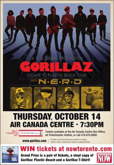 This advert for Gorillaz has been done in a cartoon/comic style whilst incorporating photographs of band members in it almost to look like they are cardboard cut outs. This seems that it will appeal it's target audience of young adults/teenagers therefore a youth audience and possibly there is even scope for the "tweenager" age group as well. The almost gothic comic book style comes across with the use of colours the blood red of the band name with the dark blues and and blacks in the background, almost like a DC Batman comic.
All three of these magazines advertisements do all have similarities, despite them being from all different genres and magazines.
The majority of adverts have one main large photograph of the band or artist,
- A large variety of fonts and sizes to attract the readers attention.
- Bright colors
- Album name
- Magazine ratings
- Where the album is available for purchase
- The artist or some form of representation of the band or singer.
- Often has the same theme as the album and digipak.


In our magazine advert we wanted to capture the two main features of our music video, the strong Australian stereotype and icons of road signs, didgeridoo's, etc. contrasted with England, especially the North of England and the suburban setting of Ilkley.
We have the kangaroo road sign turned upside down as a quirky signifier of it being "Down Under", these are our two initial drafts of the mag ad's. The one with the grenadier guard is meant to be a juxtaposition as we have the very British setting of the guard in full attire and that is a strong stereotype and figure of London and the UK so the contrast of the chilled out Australian stereotype through the road sign works nicely. Though I feel the road sign needs to be bigger or instead of having the road sign it could have been quite quirky to have the koala bear climbing about on the street light or perhaps just above the grenadier's head.
The second draft idea we had was of making the road sign, a motif throughout our music video, the central focus of the poster, with the scenic landscape behind the sun shining down. Though this seemed a little too simple for an idea and the text was rather basic, so decided to play around a bit more with the idea and thought about incorporating the koala bear into this ad with it climbing along the rock behind or clutching onto the road sign, as the koala is almost like the central protagonist in many ways following the singers about as they wander.
No comments:
Post a Comment